University of Arkansas unveils new logo

This morning, as with most mornings, I unconsciously woke up and checked my e-mail on my phone. Usually, I’ll read everything, fall asleep, and promptly forget all the Nigerian requests for money.

However, today I got a dirty sneak peak at the new UA logo. What can I say? Old Main is part of the fuzz.

The new mark was unveiled on March 3 and will be adopted on July 1, 2009. According to the argument press release, the current logo was developed in the 1980s.

University relations was commissioned to design the logo. It took nine months.

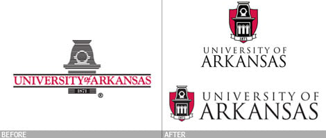
I’m not sure why university relations would opt to include the Rothrock shield. It’s a rather terrifying red, suggesting blood and violence. Note how it covers Old Main.

Or maybe red means passion. The University of Arkansas: secured, passionate learning since 1871.

“The horizontal line treatment of the old logo, which worked in some print applications, was problematic with some electronic media. Our logo had ceased to be functional and no longer represented us as the nationally competitive flagship university we’ve become,” said Tysen Kendig, associate vice chancellor for university relations.

However, according to Archive.org, the university had already changed its logo last year. The logo was filled in and dropped the IBM or “fax machine” imagery.

The type puts more emphasis on “Arkansas,” which I’m all for. However, emphasizing the state and using Trajan Pro is what Kansas did.

Chancellor G. David Gearhart asked university relations to handle the design. Gearhart said estimates from outside firms ran as high as $200,000. Am I the only one that knows how to shop around? What was the low end? Was anyone in Fayetteville asked to design the logo?

I think, in the end, university relations knew they produced an ugly logo.

“How a logo looks, whether people like or don’t like it, is only part of the equation,” said Roy Cordell, director of visual and creative services for university relations.

I’m just a kid, what do I know? What do you think about the new logo?

  • Print
  • PDF
  • email
  • Twitter
  • Facebook
  • Google Bookmarks
  • Digg
  • del.icio.us
  • StumbleUpon
  • Tumblr
  • MySpace
  • RSS

Comments

The Fayetteville Flyer doesn't necessarily condone the comments here, nor does it review every post. Read our full policy.

Duke McDingo
March 4, 2009

not real thrilled by the new logo. maybe it will grow on me. I like the logo that’s on the Alumni Sticker – just Old Main, in all black with no “IBM lines” and no shield.

In reference to the Kansas logo above: I they go by KU why the hell does it say University of Kansas, shouldn’t it be Kansas University?

Total Bastard
March 4, 2009

I think they should have left off the red shield thing and just made Old Main red where its red (the brick) and black where its black (the roof),

Corbin
March 4, 2009

Based on the shape, it looks like the more squarish one was built specifically for advertising on Web sites. I guess this one is free.

Overall: Not terrible, but not exciting.

Beebs
March 4, 2009

I’m not a design person by any means but the shield and white banner below seems a bit too “clip art from Microsoft Works ‘97″ for my taste.

Increase the Peace
March 4, 2009

I don’t care for it. Like Beebs said, it looks like Clip Art. There is nothing original in this logo. I guess they used up all the originality by using the same font as the one used in the Senior Walk.

Justin
March 4, 2009

It looks like clip art that came with Microsoft Word in 1994. I think you may even be able to get that illustration of Old Main by pressing ALT and a bunch of numbers.

And a shield?!??! With nothing on it?!?!? How does a blank shield and a Wingdings building top evoke gravitas? It doesn’t. Use Latin, people. Or animals, or stuff that may be old. That’s what it’s good for. This isn’t a university logo, it’s the stamped concrete crest placed in front of a subdivision somewhere by the airport.

-K is the new Black.

Justin
March 4, 2009

DAMN! Enough editing that I was beaten to the punch.

Sara Hebert
March 4, 2009

Its often surprising to me that universities don’t take advantage of a free design and media resource they have: students. Why not have design students get together with University Relations to come up with a concept that’s fresh and educate those students about the process at the same time?

bryce
March 4, 2009

This should have been farmed out. We live in a community with some really talented people. I suggest you use one of them next time.

$200,000 for a logo refresh…nice try dudes.

Johnathan
March 4, 2009

The real cost could have been $1000. And you give that away in a design contest for the student or community member who designs the best logo. I guarantee you’d get some good stuff from the kids in the art department.

Oh, and yeah, it’s lame.

Josh
March 4, 2009

I agree that the lines were outdated and problematic in digital media, but they had developed a couple of alternate versions with it filled in, or with thicker lines.

I also agree that they should have opened it up to the design department or the university as a whole. I mean, apparently they weren’t in a hurry. At the very least, University Relations could have garnered some better ideas from the results. It just seems like they tried too hard to pull symbols from UA’s history together into one piece.

sg
March 4, 2009

I actually like the new logo, especially when compared to the stacked plates of the previous one. Are the color choices right? Meh. Is the use of Hollywood’s favorite font right? It’s classy, if not trendy. I feel that the new mark is much improved over the previous one.

As for the $200k price tag to develop a new identity … that’s not unheard of in the design industry, depending on what firms you’re talking to. How much do you think Pepsi’s recent re-branding effort cost them? Sure, it’s not apples to apples, but a lot goes into how something as trivial a logo is designed.

Total Bastard
March 4, 2009

I thought Hollywood’s favorite font was Helvetica.

I thought Helvetica was everybody’s favorite font.

pk
March 9, 2009

What are you guys expecting? Most universities have logos that look like this one and there’s really not much else you can do with a logo. What more do you want? The university motto is too long to add.

By the way, the shield comes from the university seal.

pk
March 9, 2009

And for those of you complaining about the colors… cardinal red is a school color. Don’t expect them to throw blue or yellow in there.

pk
March 9, 2009

I keep thinking of more to add. You guys should look at the logos of some other schools. They are usually pretty simple and boring. I can’t believe some people are complaining that this logo is not “exciting”

LOL, who gets excited by logos?

Tim
March 16, 2009

I think some people need to step back and think. Unless you’ve ever designed an identity for a company or organization then you have no room to say this mark sucks. Creating an Identity that suits your client’s wants and needs is a very difficult task.
I really have to say I like the new logo. It has a sense of style, but not trendy web 2.0 style. Sure there are some things I would have done differently, but that is the case with almost everything in life.

BC
March 26, 2009

I can’t say I’m a huge fan of this new logo, but these posts saying a student design competition should solve for the logo is ridiculous. If you pay for student work you will undoubtedly get student work. Making an identity for a nationally recognized institution is a much more difficult task than just setting the schools name in the most awesome typeface. On one hand it needs to be fresh and original but most importantly it should be timeless.

The trajan pro here was a default choice and has been poorly kerned. This should have been farmed out to a studio that specifically handles branding and identity. I’m sure the in-house staff has the ability to create great promotional materials and direct-mail, but this is a whole different problem.

Will you remember this logo? Probably not.

Aaron
March 26, 2009

Since everyone thinks this logo should be free maybe the University’s accounting can be done by students as well, same with advertising, actually why not have your architecture students build the new building currently being planned instead of hiring a professional firm.

Jim Walls
March 26, 2009

Guys, I am a creative director at a Philly design firm that works with a lot of universities nationwide, and I will say that your new logo is a definite improvement. Kudos to your internal department on being able to navigate the political minefield that always accompanies any university rebranding job. I’ll also point out that the two groups who always hate any new direction taken by a university are the current students (who are always critical of any move by the administration), followed closely by the alumni (who frown on any change that differs from the old school they remember). This criticism will soon fade, and I’m sure your new look will be embraced. Now can we talk about that funky synth slap bass stock music bed in your admissions video?

a. brown
March 26, 2009

You’d think a logo with a shield wouldn’t need so many protectors.

Sean
March 27, 2009

I don’t know what you guys are complaining about. It looks much better than the old, 80’s looking logo. And, there’s much more depth than the alumni assoc. logo.

Laurie
April 1, 2009

I like it. It’s got to work in a lot of formats, and a lot of sizes, and please a lot of people. Unfortunately for some folks, the first two bits are more important than the last one.

Student INPUT would have been cool, but using the University’s award-winning University Relations staff to create it was a smart move in my opinion.

GLT
April 4, 2009

I have been looking at several posts tonight, and have noticed most of the negative comments cite things that just aren’t true. Please read the press release before railing off some half-thought under-informed argument. Allow me to respond to some of the less-informed arguments. First the “they should have asked students” argument. I know for a fact that there was extensive student consulting (you don’t spend nine months without asking all parties concerned.) Next, the “that’s way too much to spend” argument. This logo was done IN-HOUSE! This means that the team which worked on the logo was already on the payroll. Combine that with the fact that the logo will be “phased in” and the cost becomes almost nothing (they did spend time and money on things like student and community consulting.) Now on to the “student contest” idea, the University doesn’t have much of a design program, so the idea that current students would have the skill to know what works for the myriad of uses a logo has to have is a bit far fetched. Next on the list of half-thought arguments is the “community contest” idea. This is a great idea, in fact so great, that is what they did when they hired the in-house staff. They took lots of community members’ applications and portfolios into consideration and gave jobs to the ones they liked the best. Now let’s look at the “hire a professional” argument. This is one of the more ridiculous arguments. The team that created this logo is not only comprised of branding professionals, but they have a vested interest in community regard for the logo; the in-house design staff is essentially an advertising firm dedicated to a single client. Did I mention that we are already paying them? As for the “nothing is original” argument, it is true. This logo embraces historical elements beloved by the University Community. As for the “Hollywood font” argument, Trajan has much deeper roots than Hollywood, it is older than our current alphabet. Besides Hollywood has long since been in love with Helvetica. Perhaps the most unfounded argument of all is the “scary red” argument. That specific red has been the color of the University of Arkansas for a very long time. If you would rather a soothing blue, I recommend relocating to Lawrence Kansas, I hear they have a school there that isn’t so “terrifying.” The bottom line is simple; this logo works, it has aesthetic beauty, and it embraces elements of historic significance. It is a clear improvement. If you have a better logo, please post it, otherwise you may have to settle for what the University has chosen.

vax
July 2, 2009

I’m going to throw a wild guess out there that GLT is the designer.. way to be wounded man.

yea the logo isnt the best I’ve seen. Designing a Logo for the university is a pretty boring process, its got to reflect the university, please the suits, please the students, and make it attractive and representative of the university as a whole. Not a small task, but certainly not a 200k assignment unless you are contracting pentagram to do it.

seems to me one of the MANY competent professional local designers would have been able to come up with something better than the in house department that doesnt look like its bursting with design creativity (hey no offense but its not exactly ground breaking here) I personally think the students at NWACC could have done a better job, but rumor has it that their design program is better than the U of A.

still if you guys want to pay a few grand for some clipart, and give me 9 months to bang it out, yea I’m for hire too.

what I’d like to see is the other comps (assuming there were others) was this one chosen by said student groups?

I love the defense of trajan pro as well. just because you joined the millions of other designers who get all hot and bothered by using trajan for everything doesnt mean its the best font for the job. I mean yea, it works, but really, lets not claim its older than the alphabet, thats just ignorant. Its based on roman letterforms but the font itself isnt that old.

anyway, its the U of A, I hardly expect them to pick something risque and ground breaking for their corporate identity. It works fine and will probably be redone for another crazy sum of money in a few years.

/end rant

Post a Comment

We love comments but please be civil, OK? No ad hominem attacks, vulgarity, slander, libel, etc. Read our full policy.

Want a photo next to your name? Just sign up for a free Gravatar account and use that e-mail address when commenting.